0%

R-ggpairs-可视化相关性

最近想要可视化样本间的相关性,但又不满足于常规的相关性热图。因此,就注意到GGally包中的ggpairs函数,可以方便地实现多方面的相关性可视化。

本文仅介绍ggpairs 在连续型变量方面的应用。它也可以用到离散型变量的可视化上。

下面以airway数据集进行演示:
这里我们在前4个样本中随机选取1000个基因进行展示

1
2
3
4
5
6
7
8
9
10
library(GGally)
# airway example
library(airway)
data(airway)
df <- as.data.frame(assays(airway)$counts[,1:4]) #first 4 columns
df <- df[rowSums(df)>4,] #keep genes with some counts
set.seed(123)
df <- df[sample.int(nrow(df),1e3),] #random 1K gene
# ggpairs default
ggpairs(log2(df+1))

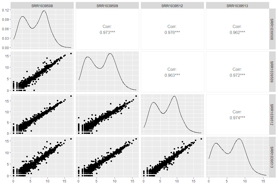
ggpairs将输出的图划分为三个区域,分别是左下角的lower, 对角线的diag, 以及右上角的upper. 对于连续性数值变量,默认在lower区画pairwise scatter plot,diag区画density plot,upper区展示相应的pairwise Pearson’s correaltion coefficient.

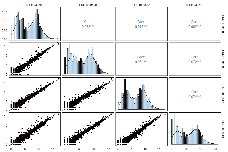
进一步,我还希望在左下角的散点图中加入y=x的拟合线,并在对角线的加上直方图。我们可以通过自定义画图的函数实现这些操作。

1
2
3
4
5
6
7
8
9
10
11
12
13
14
15
16
17
18
19
20
21
22
23
24
25
26
27
28
ggscatter <- function(data, mapping, ...) {
x <- GGally::eval_data_col(data, mapping$x)
y <- GGally::eval_data_col(data, mapping$y)
df <- data.frame(x = x, y = y)
sp1 <- ggplot(df, aes(x=x, y=y)) +
geom_point() +
geom_abline(intercept = 0, slope = 1, col = 'darkred')
return(sp1)
}

ggdehist <- function(data, mapping, ...) {
x <- GGally::eval_data_col(data, mapping$x)
df <- data.frame(x = x)
dh1 <- ggplot(df, aes(x=x)) +
geom_histogram(aes(y=..density..), bins = 50, fill = 'steelblue', color='black', alpha=.4) +
geom_density(aes(y=..density..)) +
theme_minimal()
return(dh1)
}

ggpairs(log2(df+1),
lower = list(continuous = wrap(ggscatter)),
diag = list(continuous = wrap(ggdehist))) +
theme_minimal() +
theme(panel.grid = element_blank(),
panel.border = element_rect(fill=NA),
axis.text = element_text(color='black'))

再放一个高度修改的版本

1
2
3
4
5
6
7
8
9
10
11
12
13
14
15
16
17
18
19
20
21
22
23
24
25
26
27
28
29
30
31
32
33
34
35
36
37
38
39
40
41
42
43
44
45
46
47
48
49
50
51
52
53
54
55
56
57
58
59
60
61
62
63
64
65
66
# https://pascal-martin.netlify.app/post/nicer-scatterplot-in-gggally/
GGscatterPlot <- function(data, mapping, ...,
method = "pearson") {

#Get correlation coefficient
x <- GGally::eval_data_col(data, mapping$x)
y <- GGally::eval_data_col(data, mapping$y)

cor <- cor(x, y, method = method, use="pairwise.complete.obs")
#Assemble data frame
df <- data.frame(x = x, y = y)
df <- na.omit(df)
# PCA
nonNull <- x!=0 & y!=0
dfpc <- prcomp(~x+y, df[nonNull,])
df$cols <- predict(dfpc, df)[,1]
# Define the direction of color range based on PC1 orientation:
dfsum <- x+y
colDirection <- ifelse(dfsum[which.max(df$cols)] <
dfsum[which.min(df$cols)],
1,
-1)
#Get 2D density for alpha
dens2D <- MASS::kde2d(df$x, df$y)
df$density <- fields::interp.surface(dens2D ,df[,c("x", "y")])

if (any(df$density==0)) {
mini2D = min(df$density[df$density!=0]) #smallest non zero value
df$density[df$density==0] <- mini2D
}
#Prepare plot
pp <- ggplot(df, aes(x=x, y=y, alpha = 1/density, color = cols)) +
ggplot2::geom_point(shape=16, show.legend = FALSE) +
ggplot2::scale_color_viridis_c(direction = colDirection) +
ggplot2::scale_alpha(range = c(.05, .6)) +
ggplot2::geom_abline(intercept = 0, slope = 1, col="darkred") +
ggplot2::geom_label(
data = data.frame(
xlabel = min(x, na.rm = TRUE),
ylabel = max(y, na.rm = TRUE),
lab = round(cor, digits = 3)),
mapping = ggplot2::aes(x = xlabel,
y = ylabel,
label = lab),
hjust = 0, vjust = 1,
size = 3, fontface = "bold",
inherit.aes = FALSE # do not inherit anything from the ...
) +
theme_bw()
return(pp)
}

exonNumber <- elementNROWS(rowRanges(airway[rownames(df),]))
df$MoreThan15Exons <- ifelse(exonNumber>15,
">15ex", "<15ex")
df[,1:4] <- log2(df[,1:4]+1)
GGally::ggpairs(df,
1:4,
lower = list(continuous = wrap(GGscatterPlot, method="pearson")),
upper = list(continuous = wrap(ggally_cor, align_percent = 0.8),
mapping = ggplot2::aes(color = MoreThan15Exons))) +
theme_minimal() +
theme(panel.grid = element_blank(),
panel.border = element_rect(fill=NA),
axis.text = element_text(color='black'))

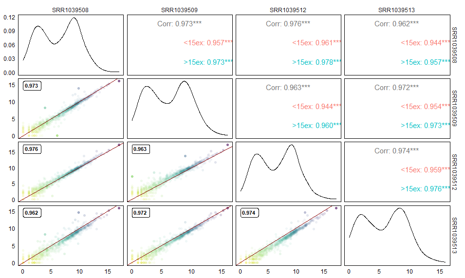
  • 对散点图的透明度进行调整,点越密的区域透明度越高,反之亦然。
  • 散点图的颜色代表了基因表达量。
  • 在散点图左上角添加Pearson’s 相关系数
  • 右上角展示了对小于15个外显子的基因和大于15个外显子基因的相关性的统计。

在我看来ggpairs相当于是一个ggplot2的集成可视化方法,可以很方便的一次性展示多个方面的相关性信息。同时,它的可定制性也很高,可以满足许多额外的可视化需求。唯一的缺陷可能是需要耗费一定功夫写出包装的函数。

Ref:
ggpairs doc: https://ggobi.github.io/ggally/articles/ggpairs.html
Nicer scatter plots in GGgally ggpairs-ggduo: https://pascal-martin.netlify.app/post/nicer-scatterplot-in-gggally
Creating a density histogram in ggplot2: https://stackoverflow.com/questions/21061653/creating-a-density-histogram-in-ggplot2

完。